ASEAN Year of Skills (AYOS) 2025
Role
Lead Designer for regional brand identity and visual rollout across print, merchandise, event graphics and live LED console control.
The Task
Create a brand identity for AYOS 2025, a campaign celebrating skills across Southeast Asia. It needed to work at both high-level ministerial events and youth-focused engagements. Clarity, adaptability and cultural sensitivity were key.
Creative Direction
The identity carried a sense of motion and shared purpose. Shapes moved forward, colours held meaning and the overall system felt grounded yet open. Everything was built to feel steady, clear and ready for the region it spoke to.
Design Foundation
The identity featured ten arrows to represent all ASEAN member states. A strict grid helped maintain logo alignment across both horizontal and vertical uses. The colours were chosen to reflect ASEAN values such as peace, courage and prosperity. Typography was clean and neutral, ensuring legibility in print and digital formats.
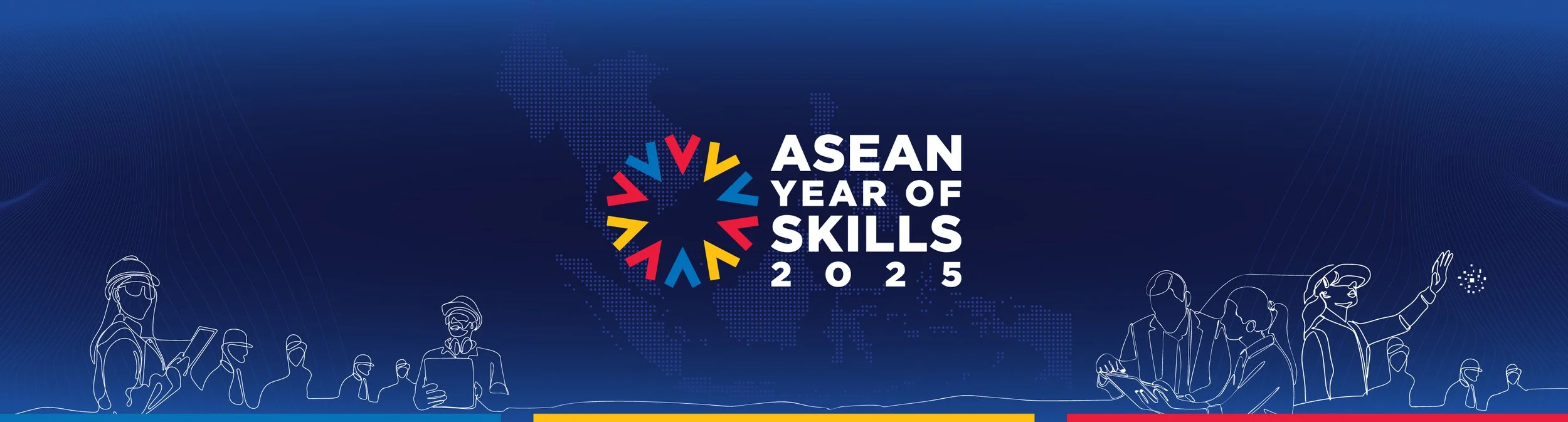
The AYOS 2025 identity reflects ASEAN unity and skills commitment, with ten arrows symbolising progress and shared goals.
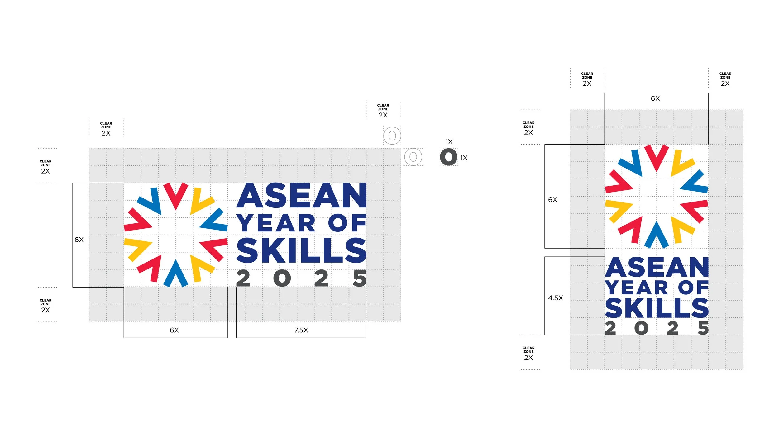
The grid ensures correct logo and descriptor alignment in both horizontal and vertical formats.
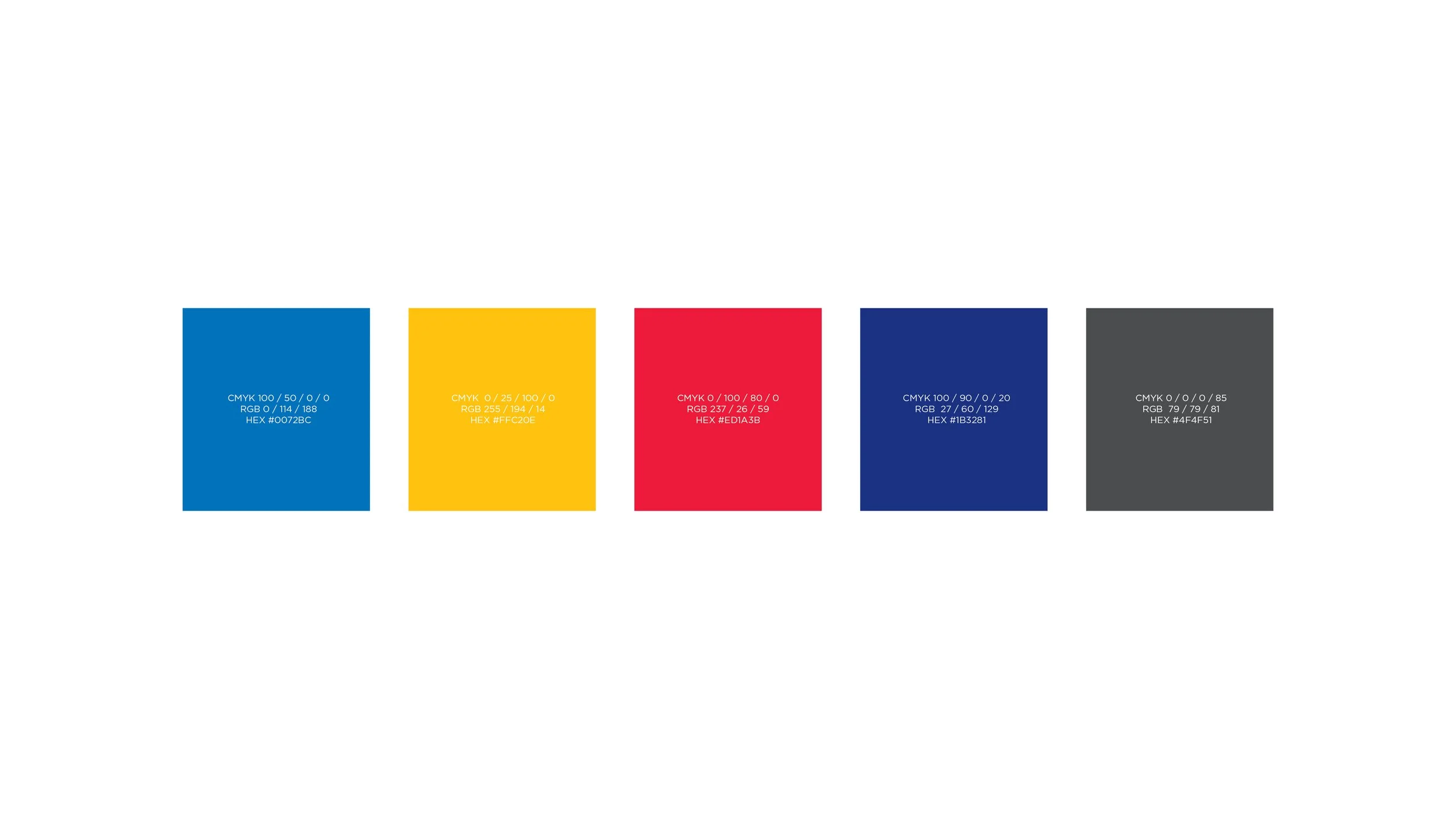
Colours mirror ASEAN values: peace, courage, purity, and prosperity.
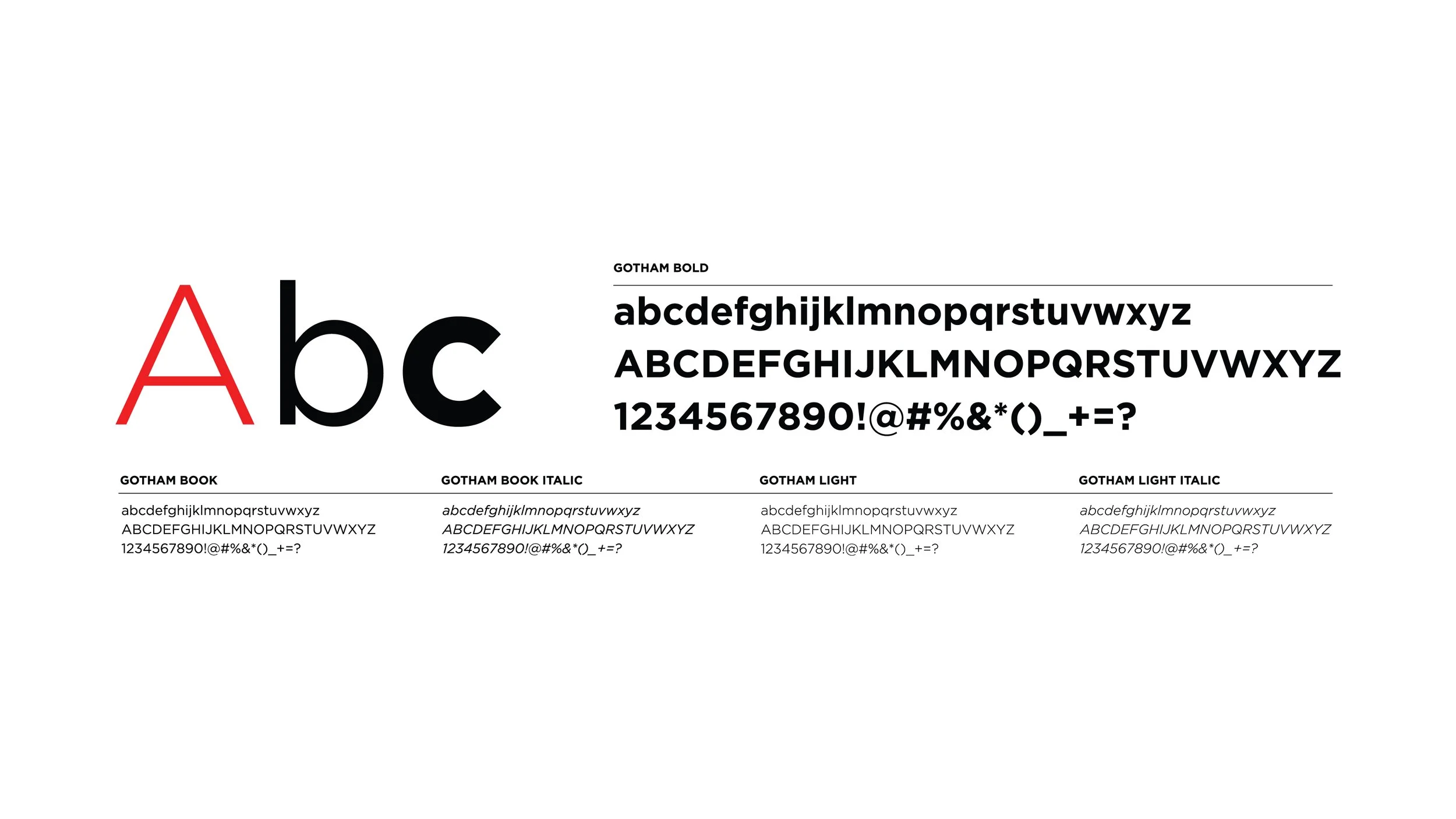
Gotham typeface offers a clean, modern look, ensuring clarity and consistency.
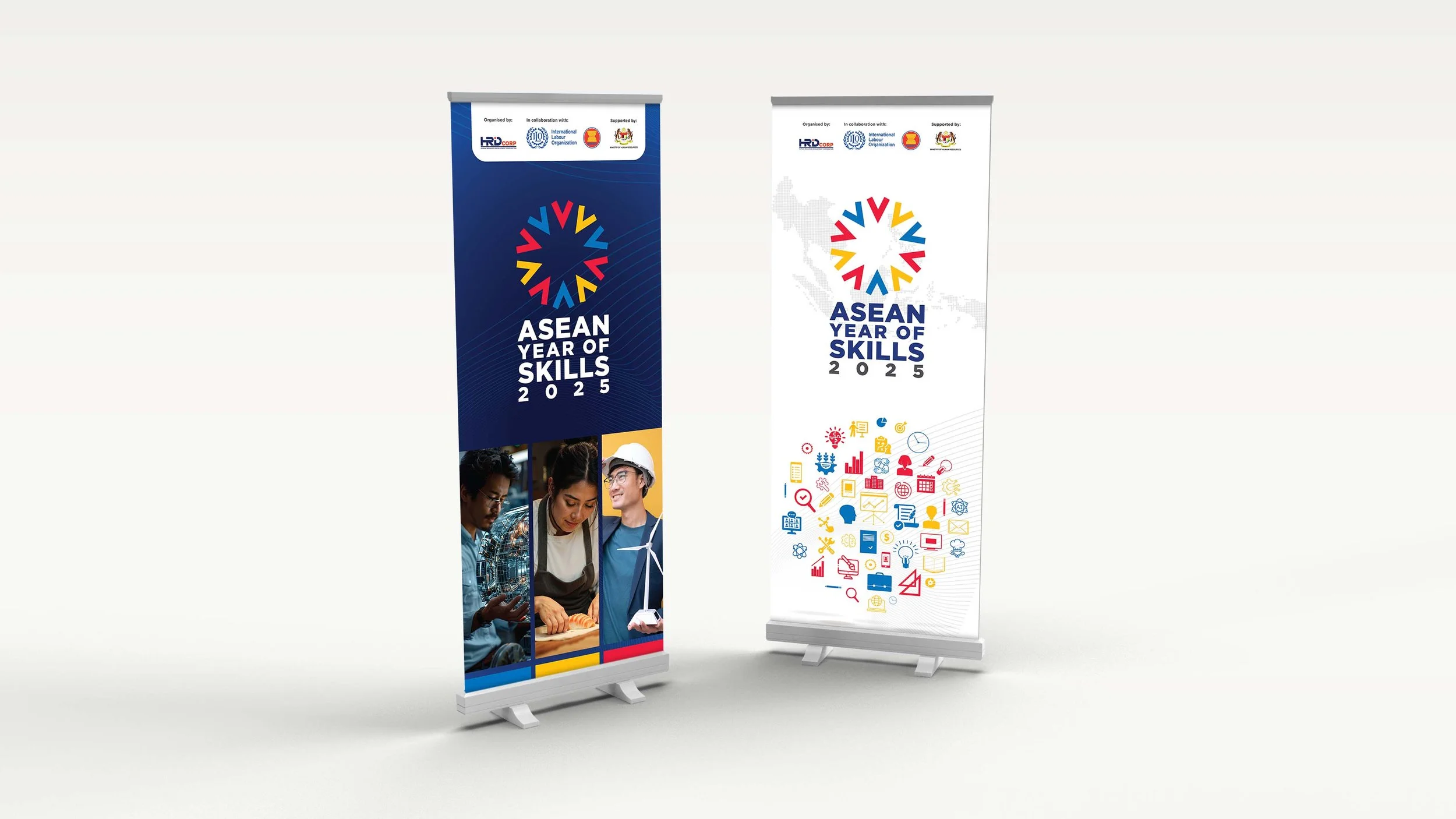
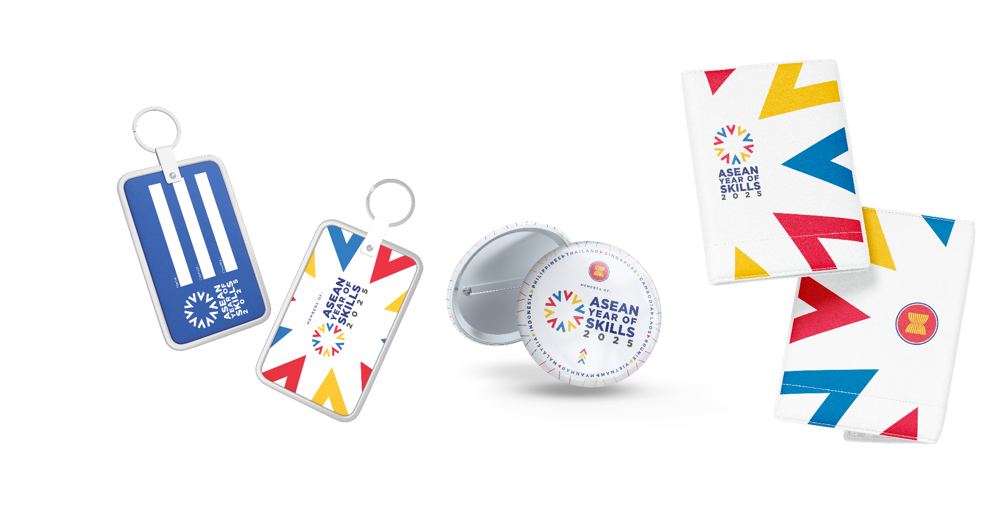
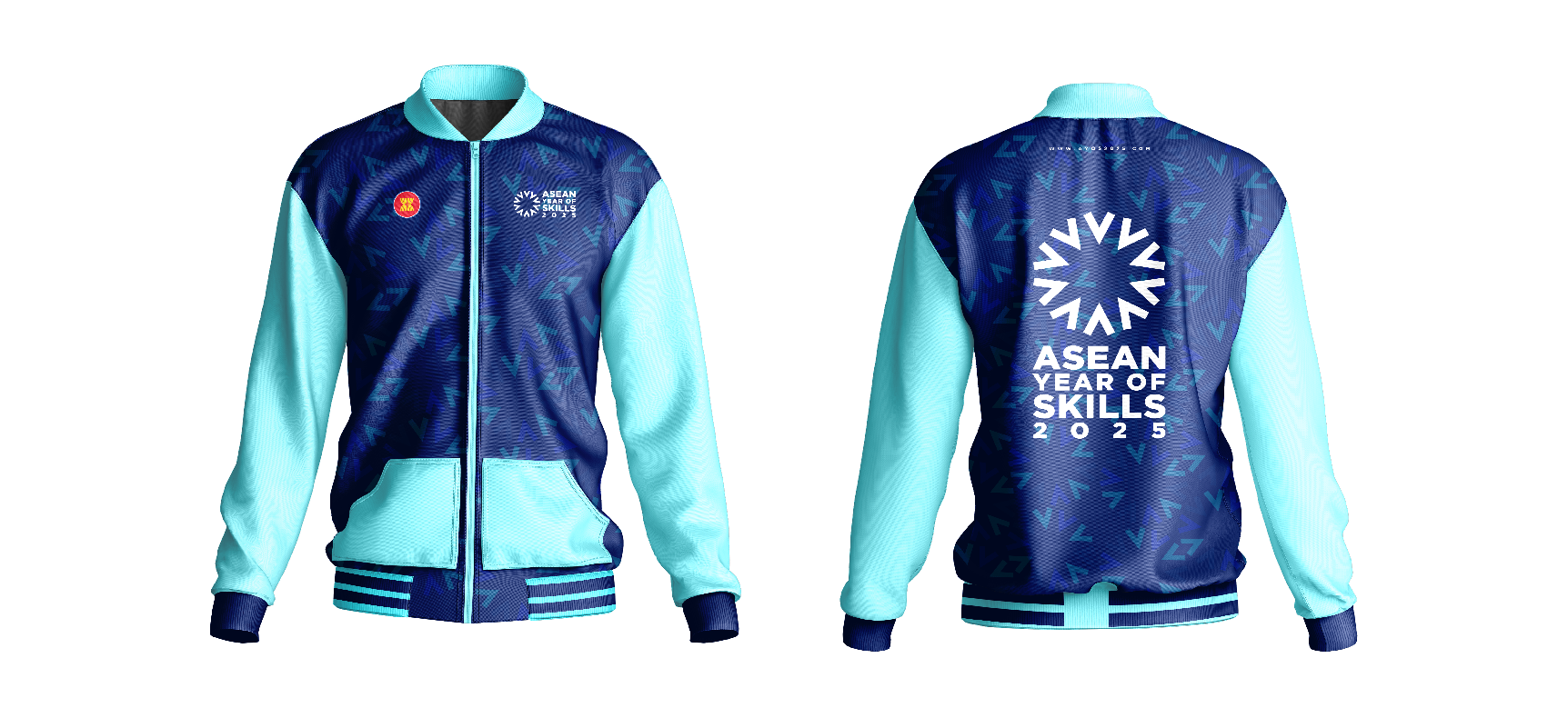
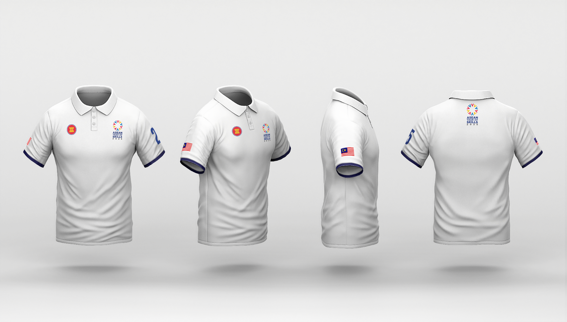
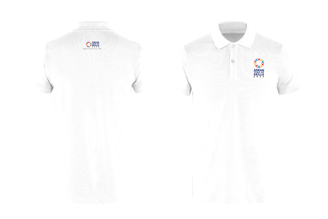
Applications Across Platforms
From official documents and roll up banners to keychains, jackets and USB drives, the visual system adapted smoothly across all formats. Each item was created to reflect the same message of unity and progress, whether displayed at policy forums or handed out during youth-focused activities.
Print materials carried a formal tone for meetings and official use, while branded items added a more personal and everyday touch. This balance helped the identity stay consistent and recognisable, making sure the message felt present in both structured and casual settings.


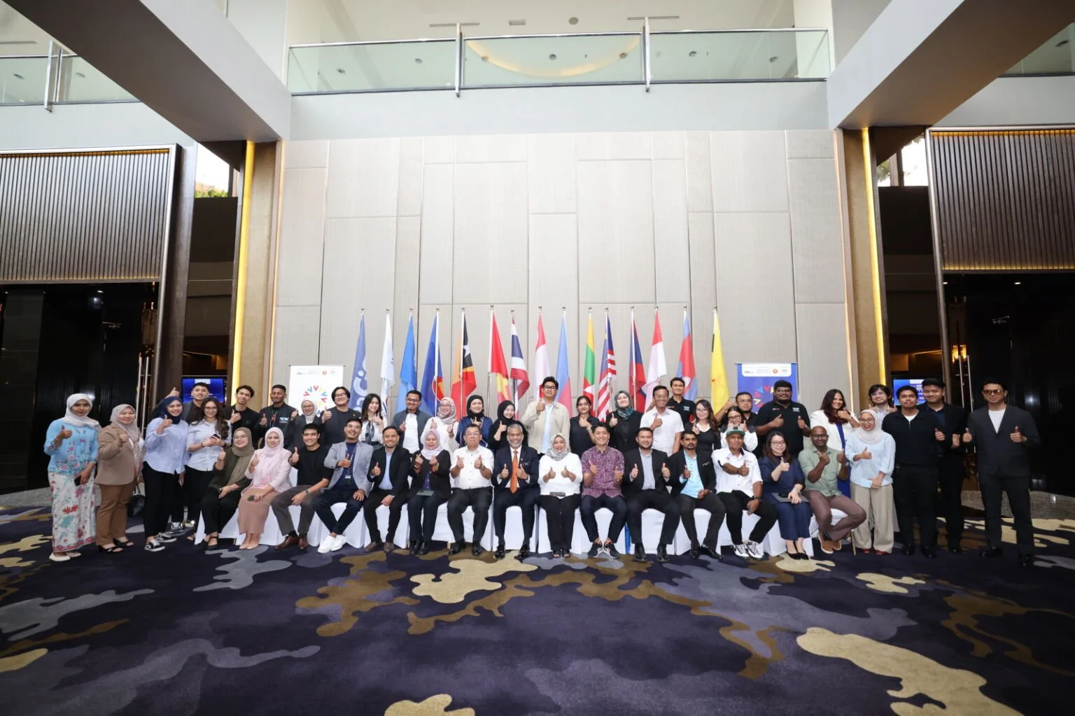
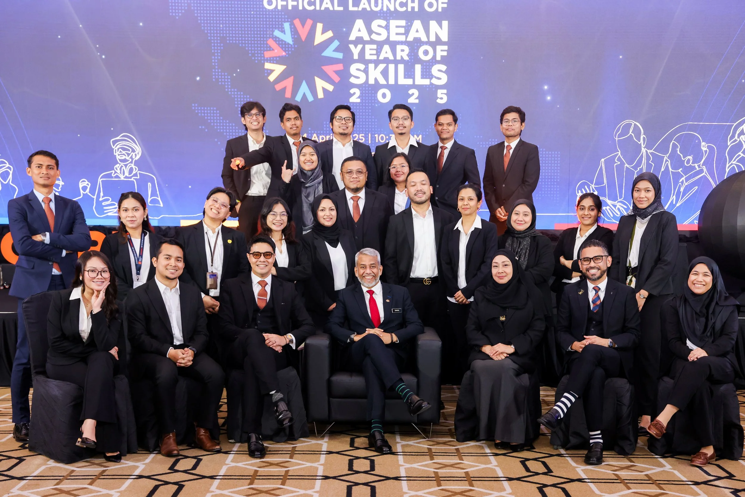
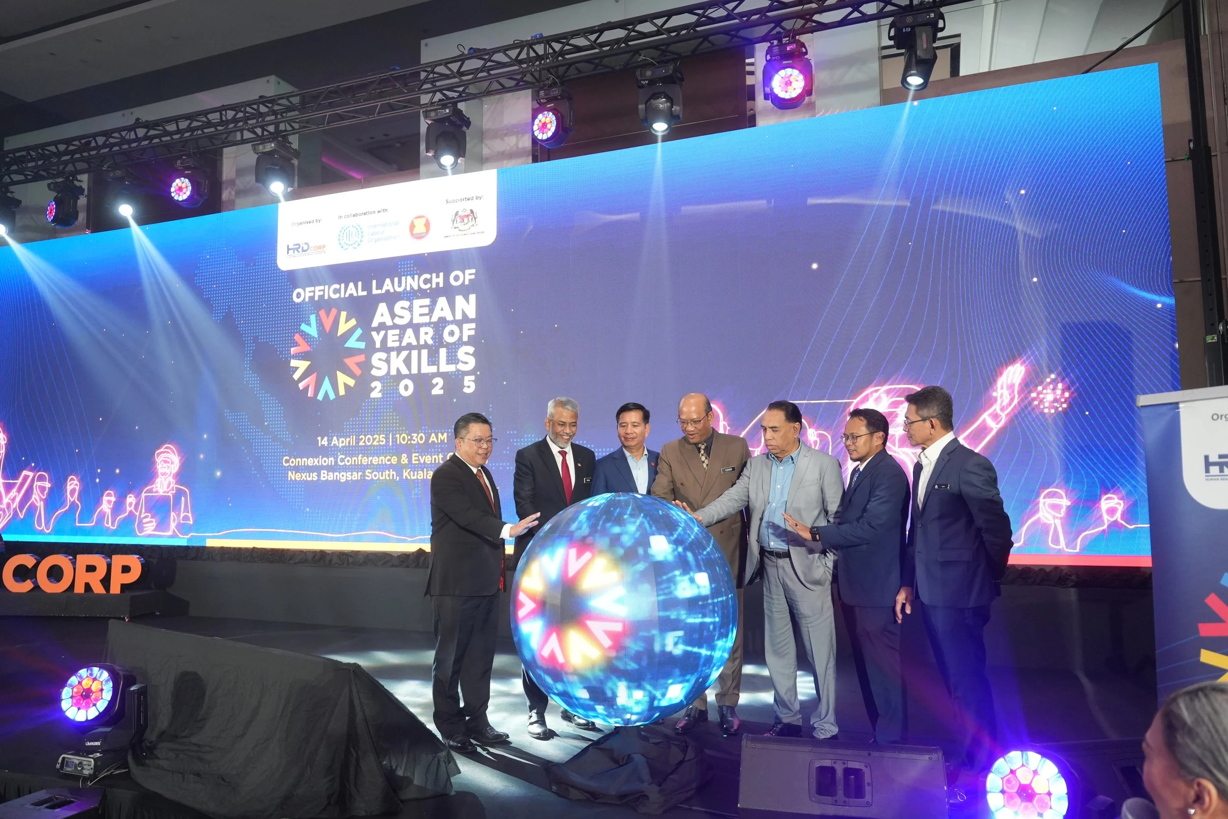
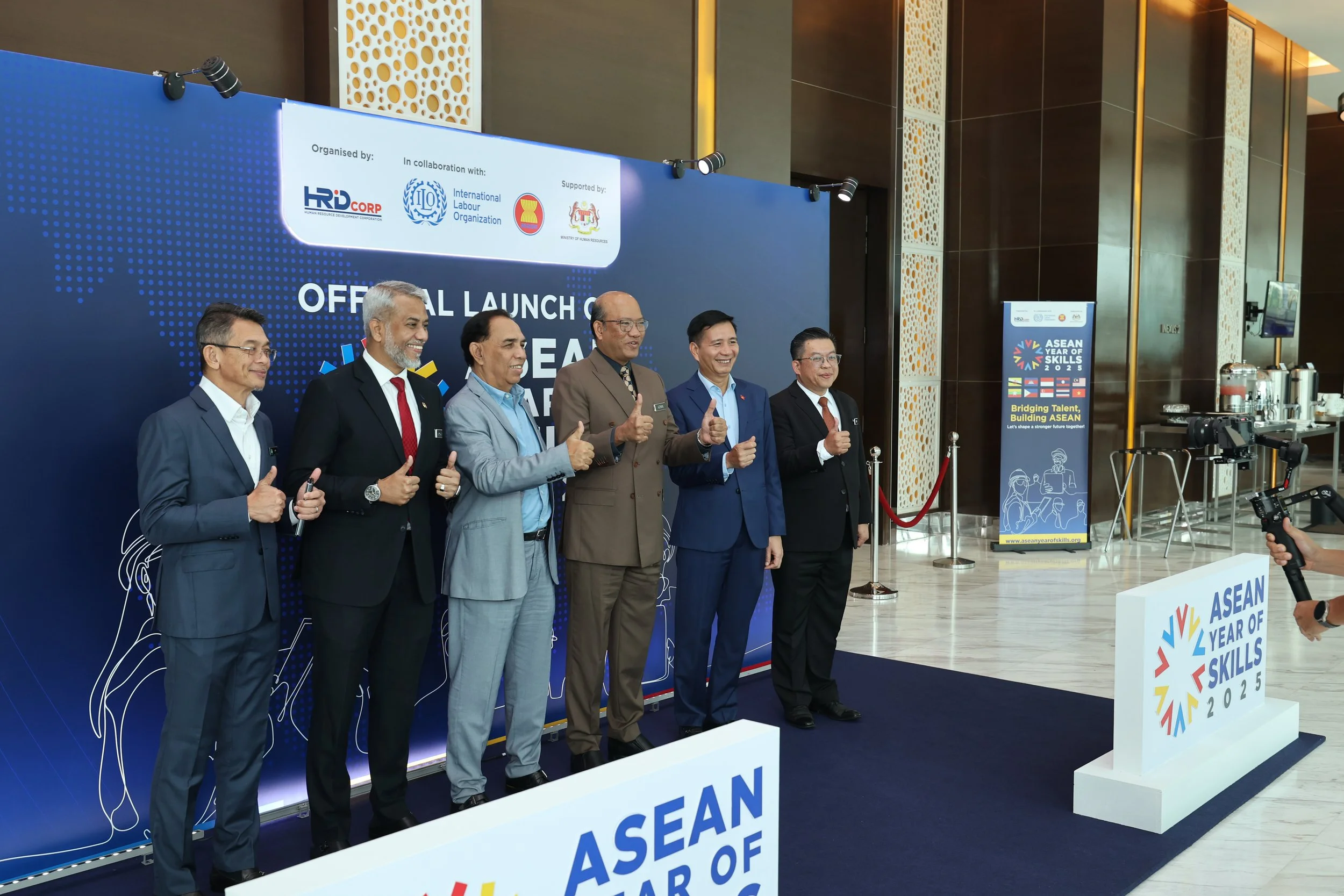
Regional Rollout
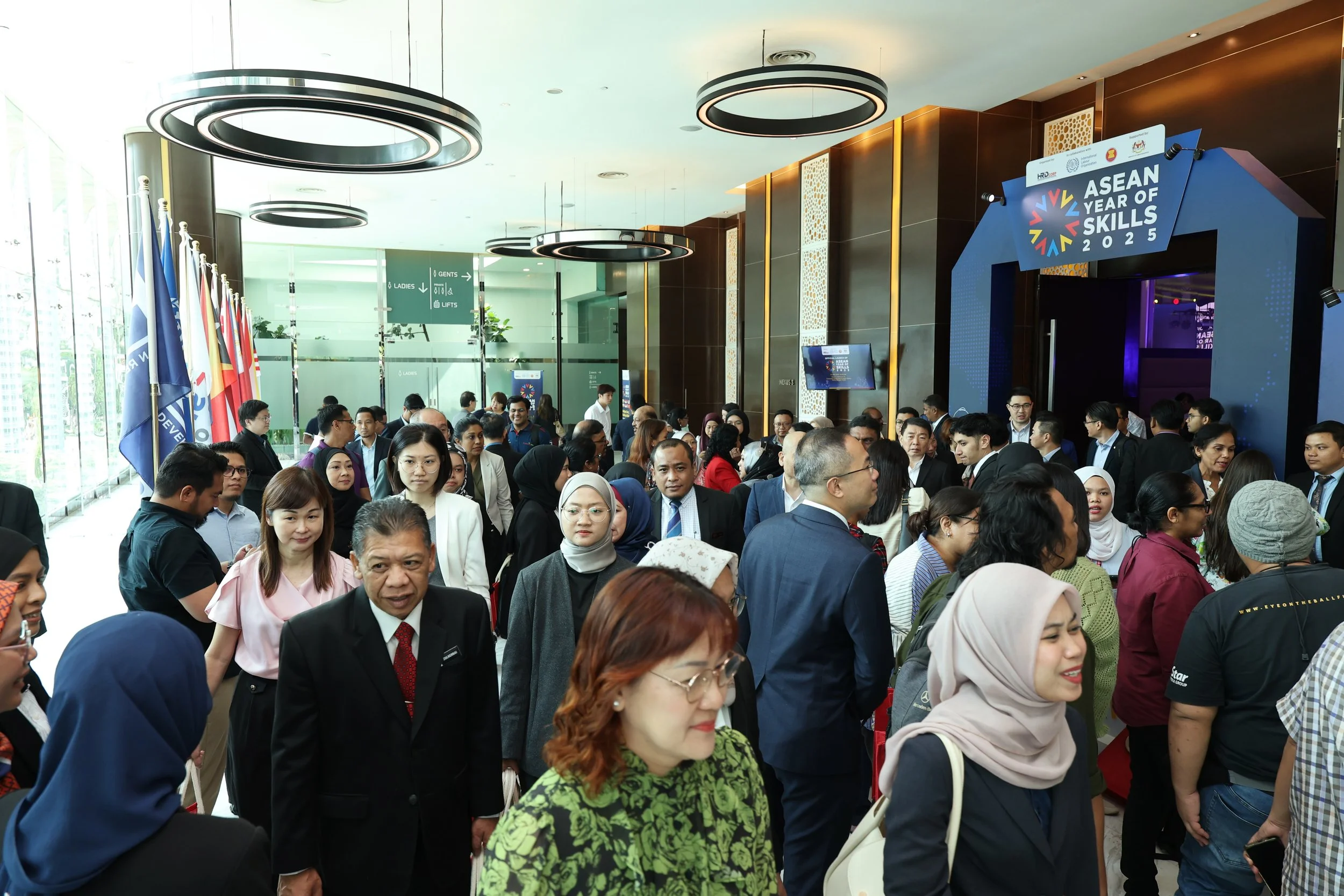
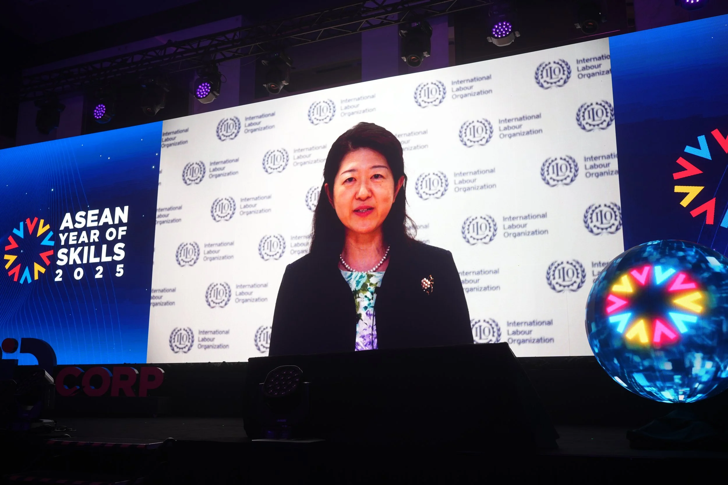
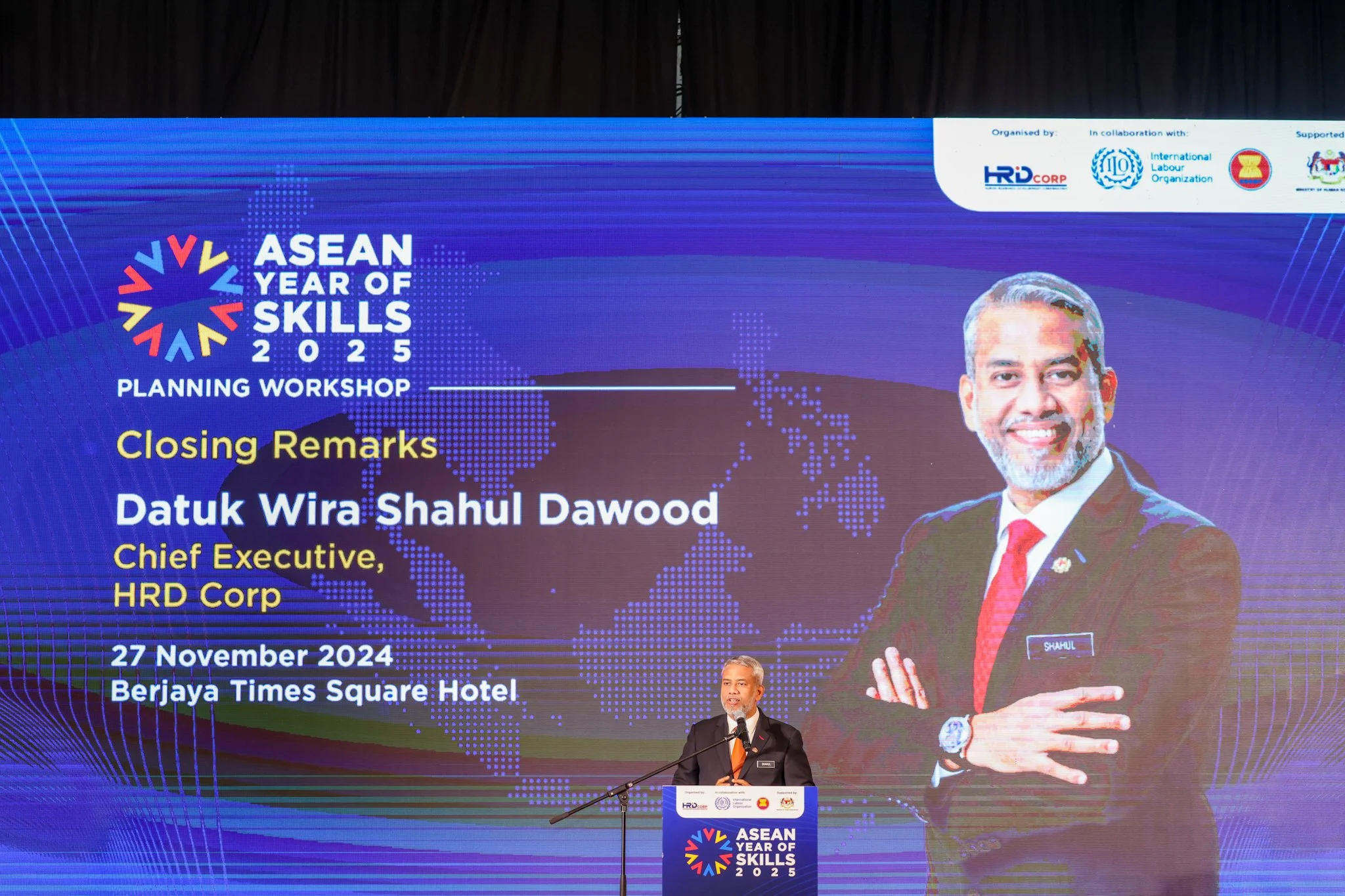
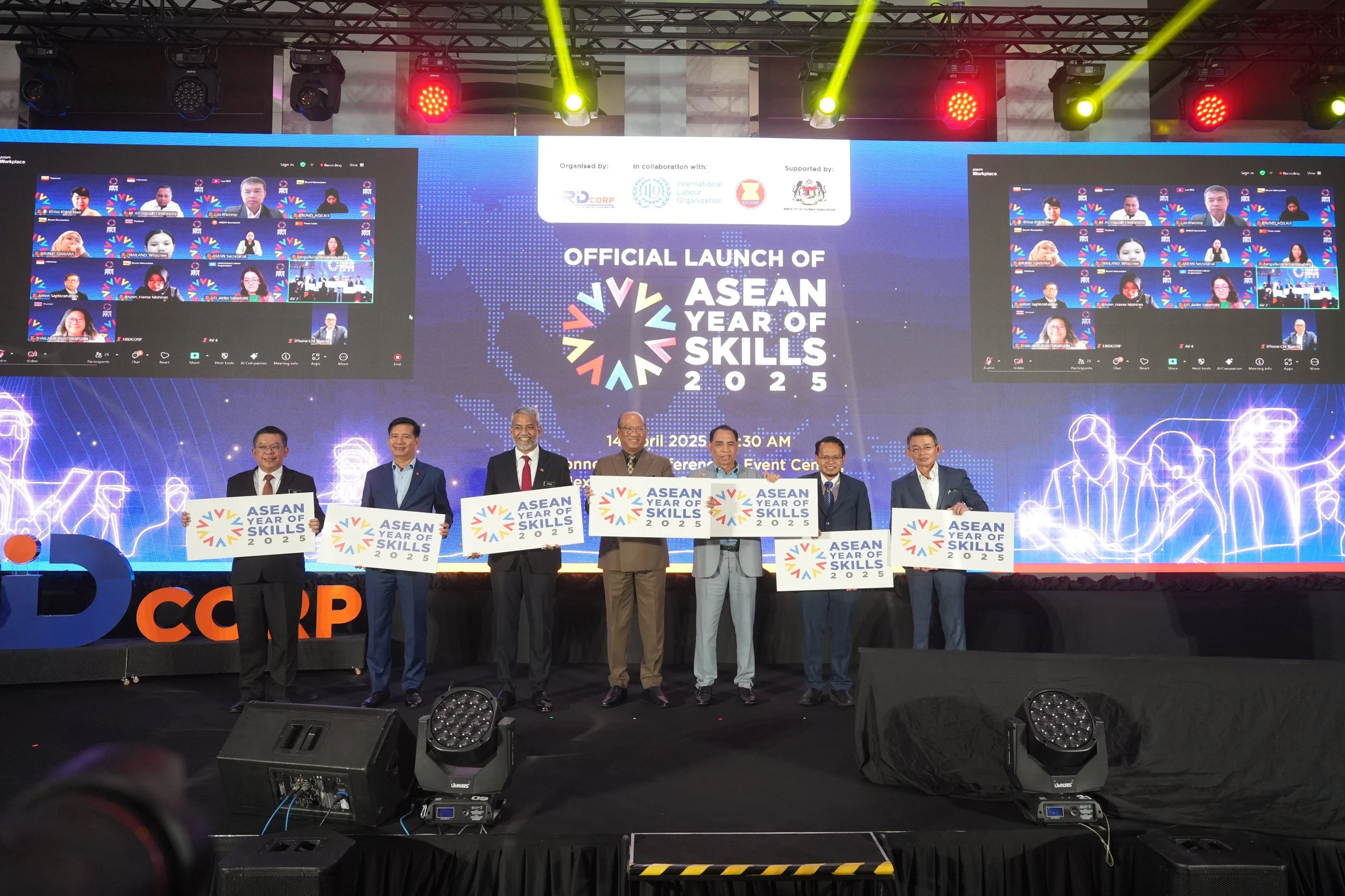
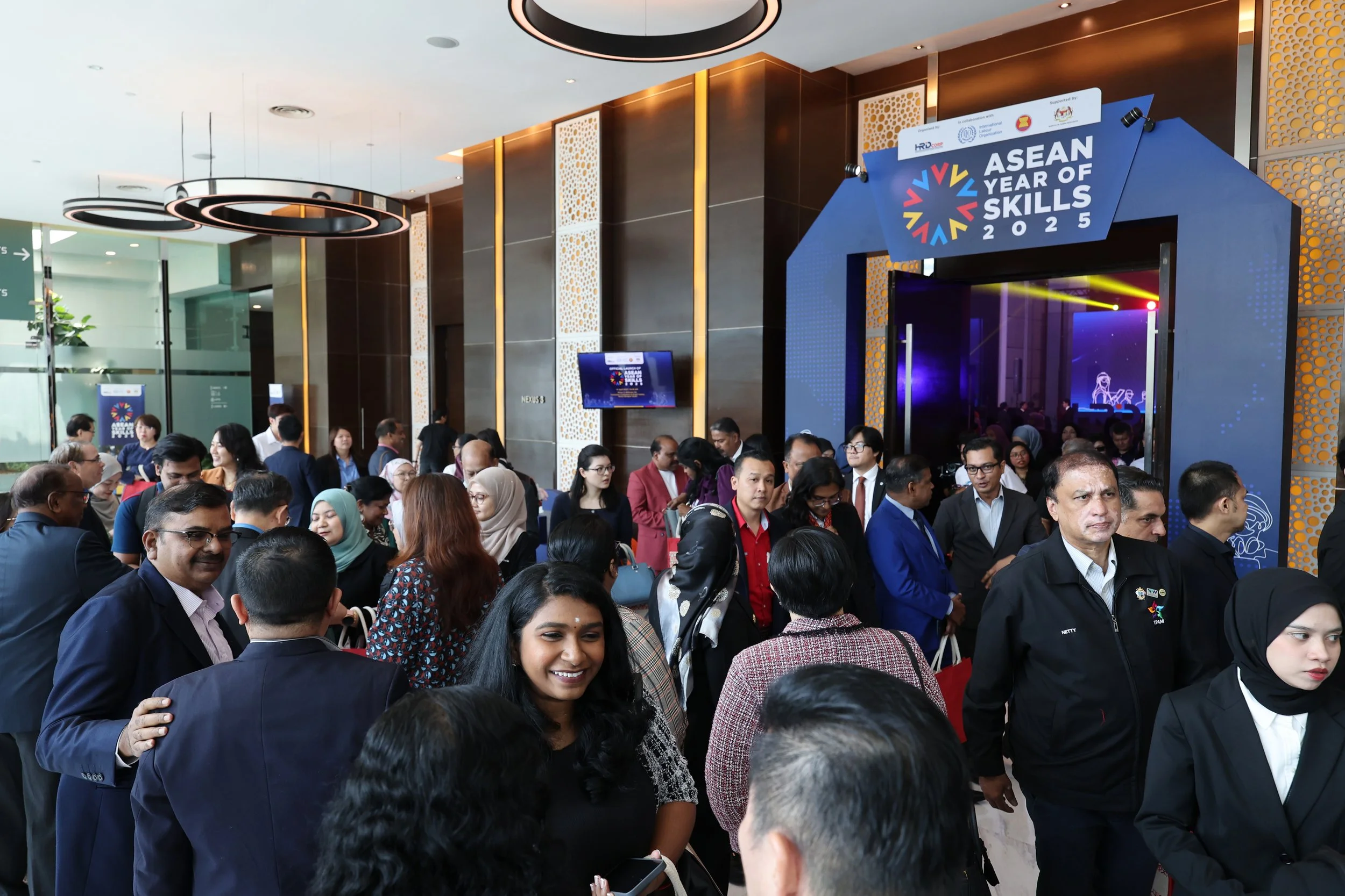
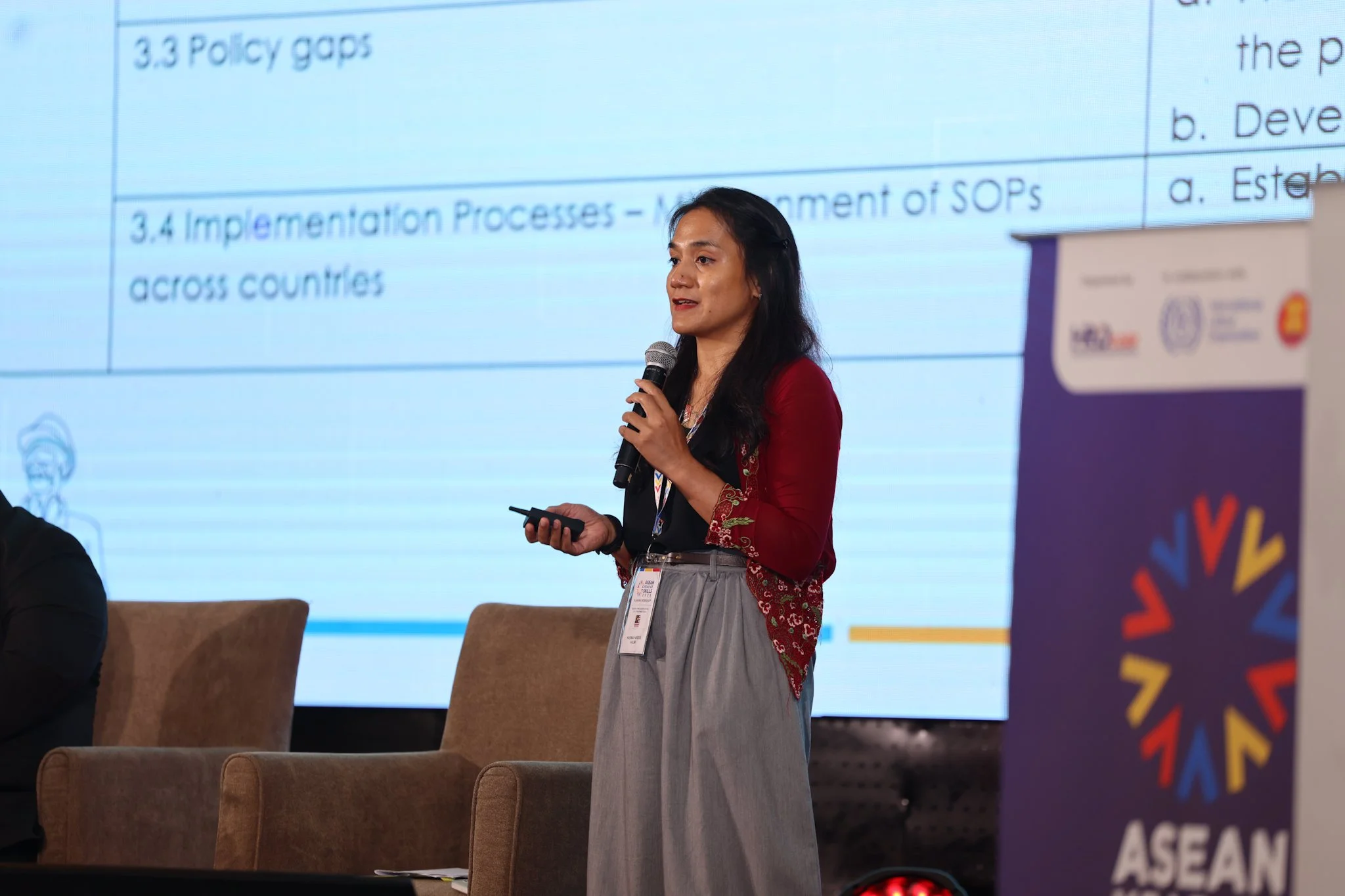
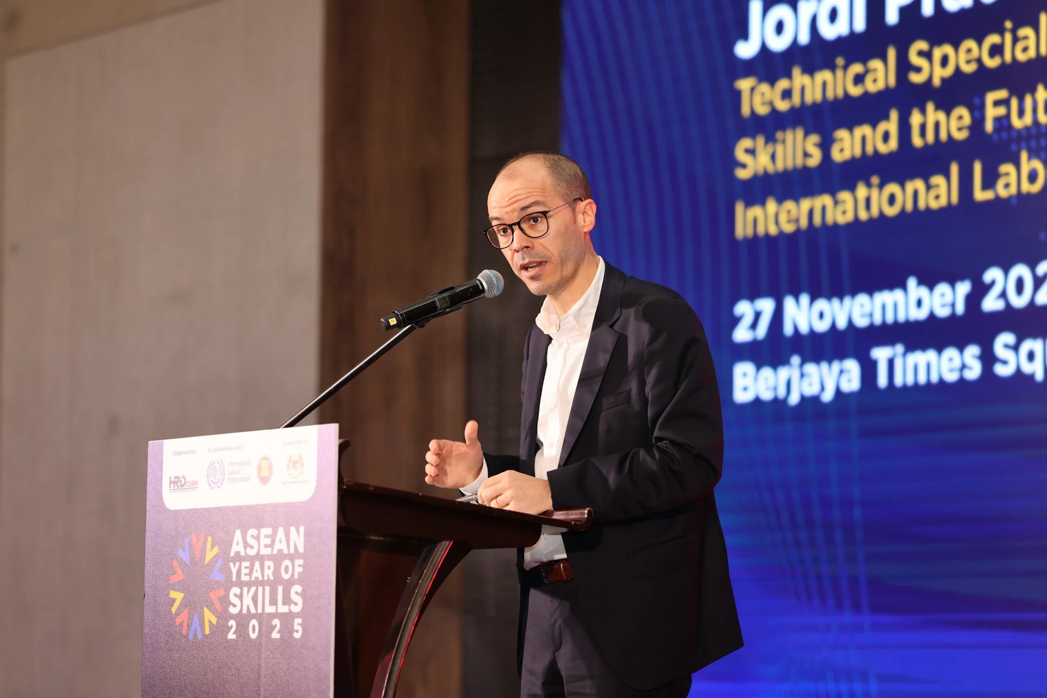
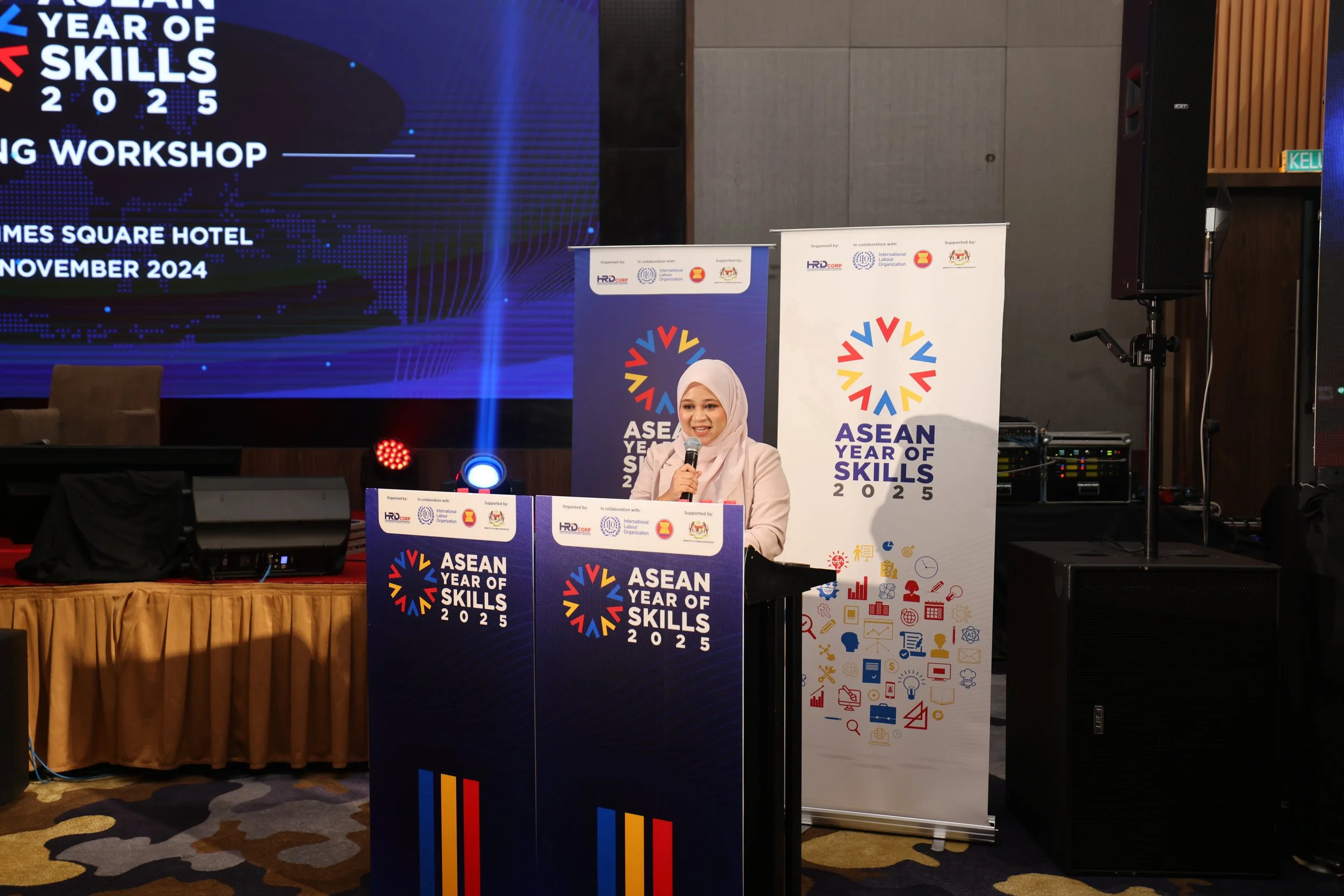
The brand launched officially in April 2025, following an early strategic workshop in November 2024. This set the direction for all key engagements across the region. At each event, large-scale visuals, merchandise and digital content kept the identity alive. Brand visibility was tightly managed to ensure consistency throughout.
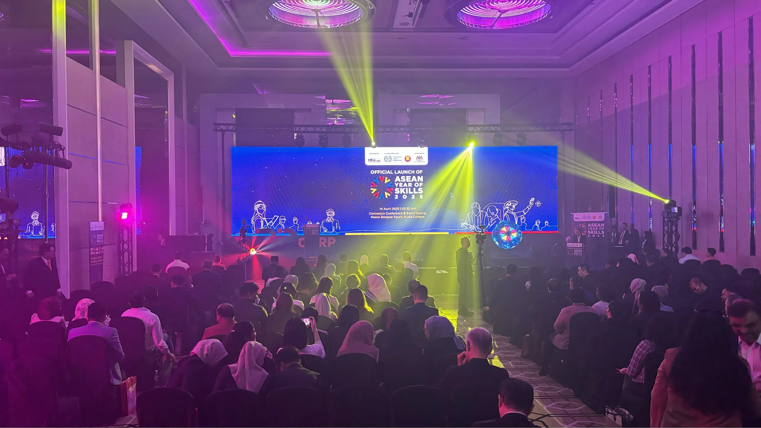


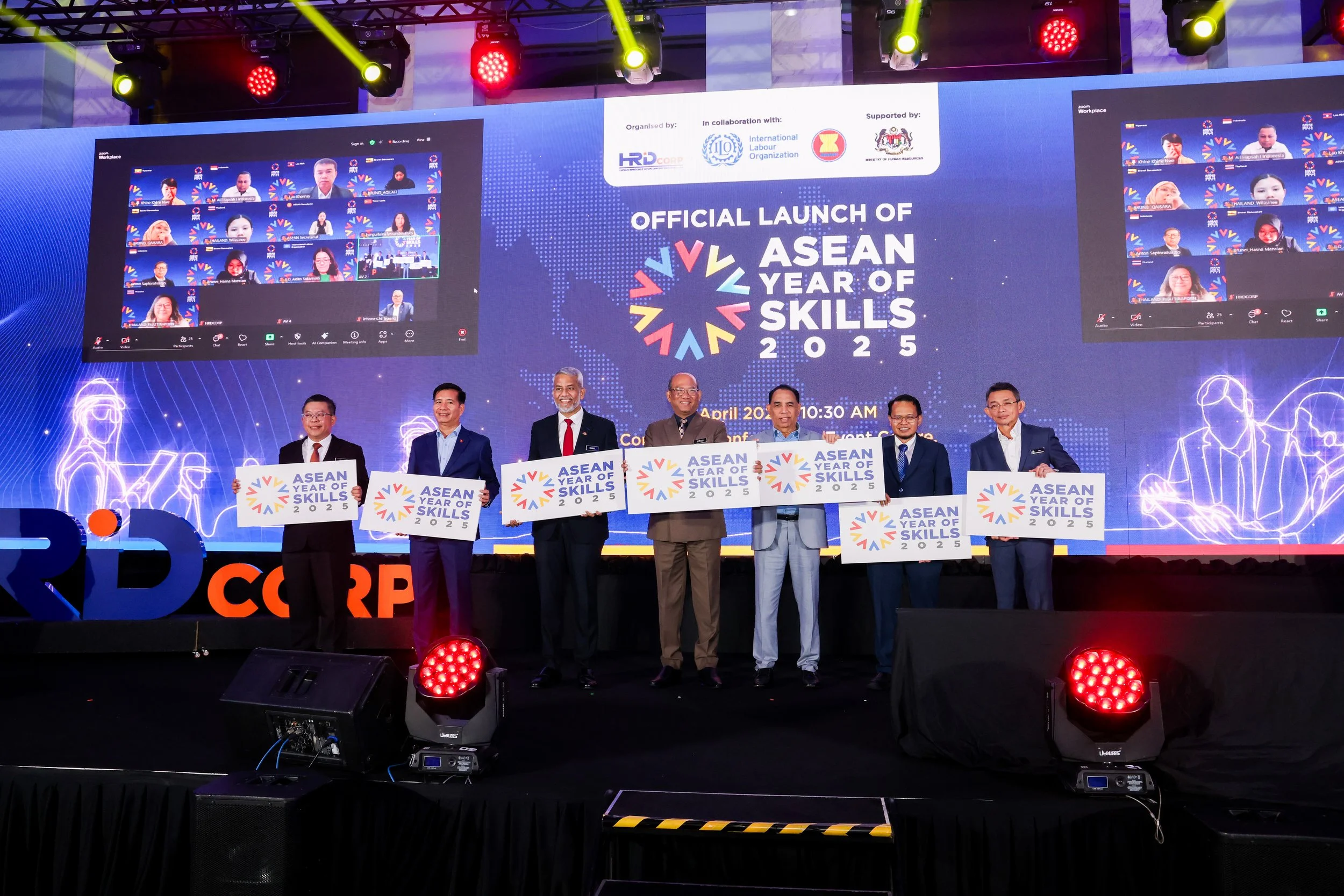
Bringing It to Life
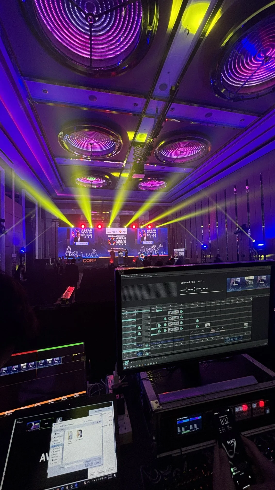
AYOS 2025 went beyond just creating a brand look. The role extended into live execution, where visuals were controlled in real time from the LED console to match the flow of each programme. Every transition was timed with intention, helping the identity stay in sync with the emotion and pace of the moment.
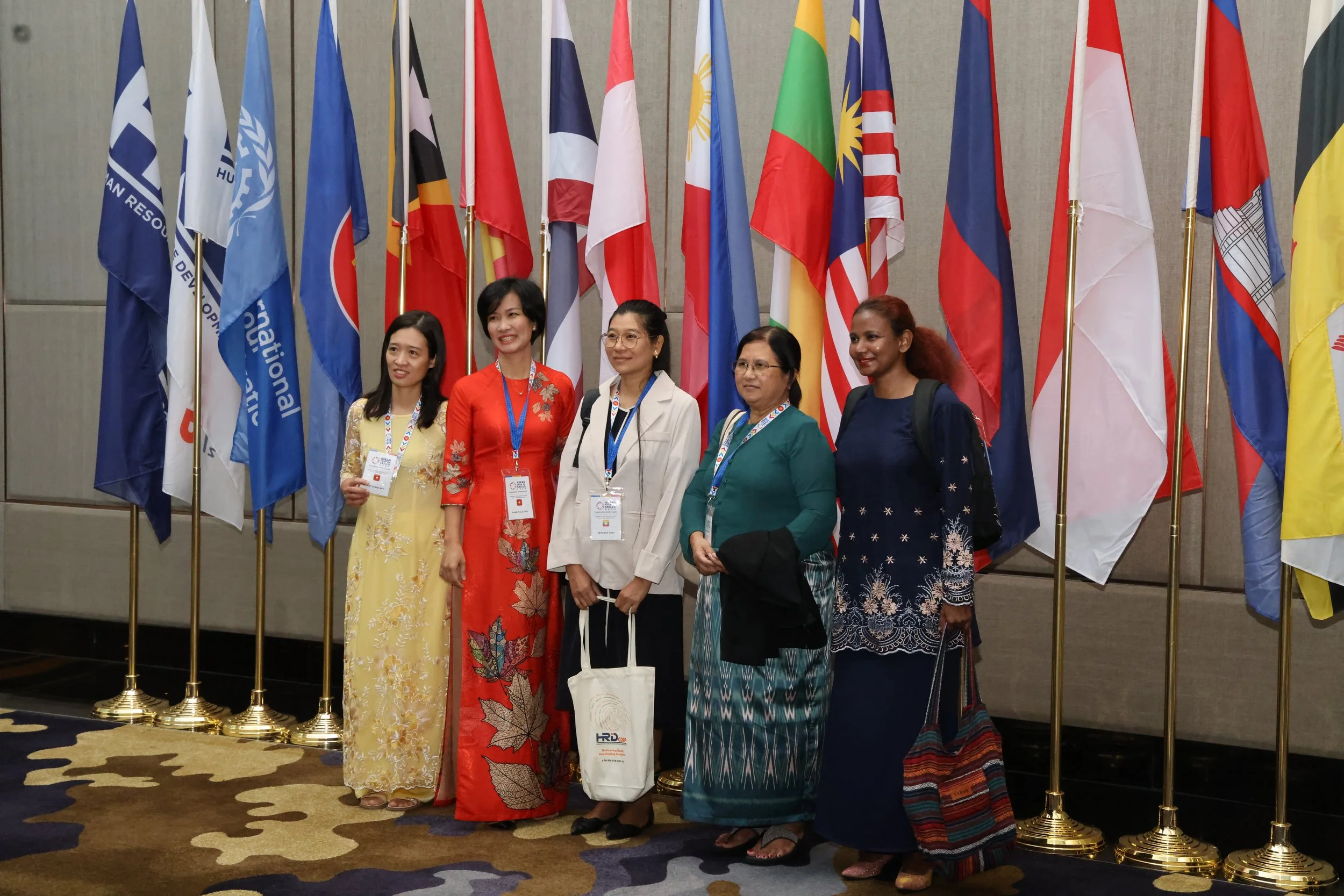
Design choices were guided by people, not just platforms. From policymakers to young learners, every audience was considered. The visuals carried a tone that felt open, respectful and inclusive across all cultures and languages.
What started as a brand system grew into a shared experience. One that connected, uplifted and brought the region closer together through clarity, rhythm and purpose.